Brand Style Guide
Purpose
The “Brand Style Guide” is intended to ensure all collateral put together by the PAX adhere to the styling design choices for our region, which was established as part of building out the F3 Twin Cities website. The theme established serves as a guide for all PAX members to support consistency and coherency while producing digital and print content that’s distributed across our region.
Typography
At the end of the day, it’s up to the discretion of the designer to determine which type to use, when to use it, and how large the font should be. Below are the F3 Twin Cities official types:
BLACK OPS
The “Black Ops” type is the “header” for our type collection. Reserve this type for headers and possibly sub-headers, depending on the size of the design. This should be used sparingly and should always be in ALL CAPS.
DM Sans
Any text that isn’t the main header for your design should be set to the “DM Sans” type. If this isn’t available for use in your design software, use “sans serif” instead. This type should be used for body text, lists, and likely sub-headers if the size of the design isn’t large.
Color palette
#242A2B
The primary background for F3 Twin Cities content.
White should be used as the text color when this is the background.
#FFFFFF
The secondary background for F3 Twin Cities content.
Black should be used as the text color when this is the background.
#EE6059
Our accent color. Use this sparingly to add emphasis or contrast to your design (e.g. a line dividing content, emphasizing text, etc.)
#1E2123
The secondary black for F3 Twin Cities content. Intended to be used to help section off content (e.g. our home page).
Materials
Want to get in on the action? Click here for access to a variety of logos to incorporate into your F3 Twin Cities design.
The Brand Style Guide in action
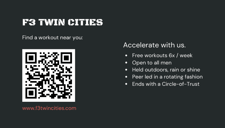
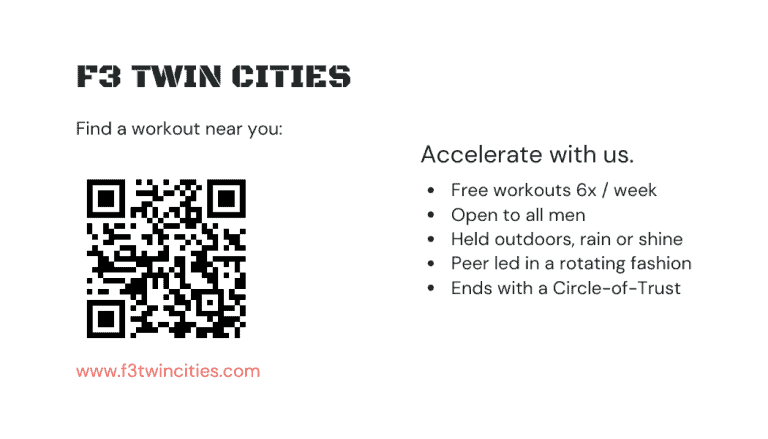
The F3 Twin Cities website will be your best source of reference when building out content that adheres to our Brand Style Guide. Below is another example on print-specific collateral that is designed with our defined set of styling in mind:
- Our “contrast” orange is used sparingly
- The “Black Ops” type is only used once
- Sub-header and body text is utilizing the “DM Sans” type


